Hertz mobile app
interaction + visual DESIGN

I took on this super short design sprint aimed at redesigning the Hertz mobile app. While the current app isn’t terrible, the challenge involved redesigning the interface to provide more information and guidance to the user in the rental car reservation process.
I wouldn’t exactly call myself a visual designer, but given how short this sprint was, I was really happy with the interactions I designed and with the visual design of the UI.
-
role
ux + visual designer
-
timeframe
3 days (!!)
-
status
completed
01
Research
Due to the nature of the project, I didn’t have time to conduct a full-fledged cycle of research, BUT I did use the information that was readily available to me. To see where the app fell short in providing information and guidance to users, I turned to the Apple App Store and read through reviews to see what users were saying about the app.
To understand the Hertz rental process better, I tried to rent a car through the app myself and asked a few of my family and friends to do the same. I also turned to the Hertz website to make sure I fully understood to rental process.
TAKEAWAYS
Users found the rental reservation process is a bit too complex / hard to understand
The interface was kind of annoying to use — a lot of pop up panels, unorganized screens, and unnecessary scrolling
Reservations are dependent on what’s available at a location within the dates that the customer plans to rent a car
Hertz only shows users the types of cars available at a location.
02
Ideation
The lil’ baby amount of research I did still provided plenty to inform my design ideas. I decided that I wanted to focus my time around redesigning the current (kinda gross) layout of the screen where users browse through and select available cars. I also wanted to clean up and streamline the user flow for the entire reservation process.
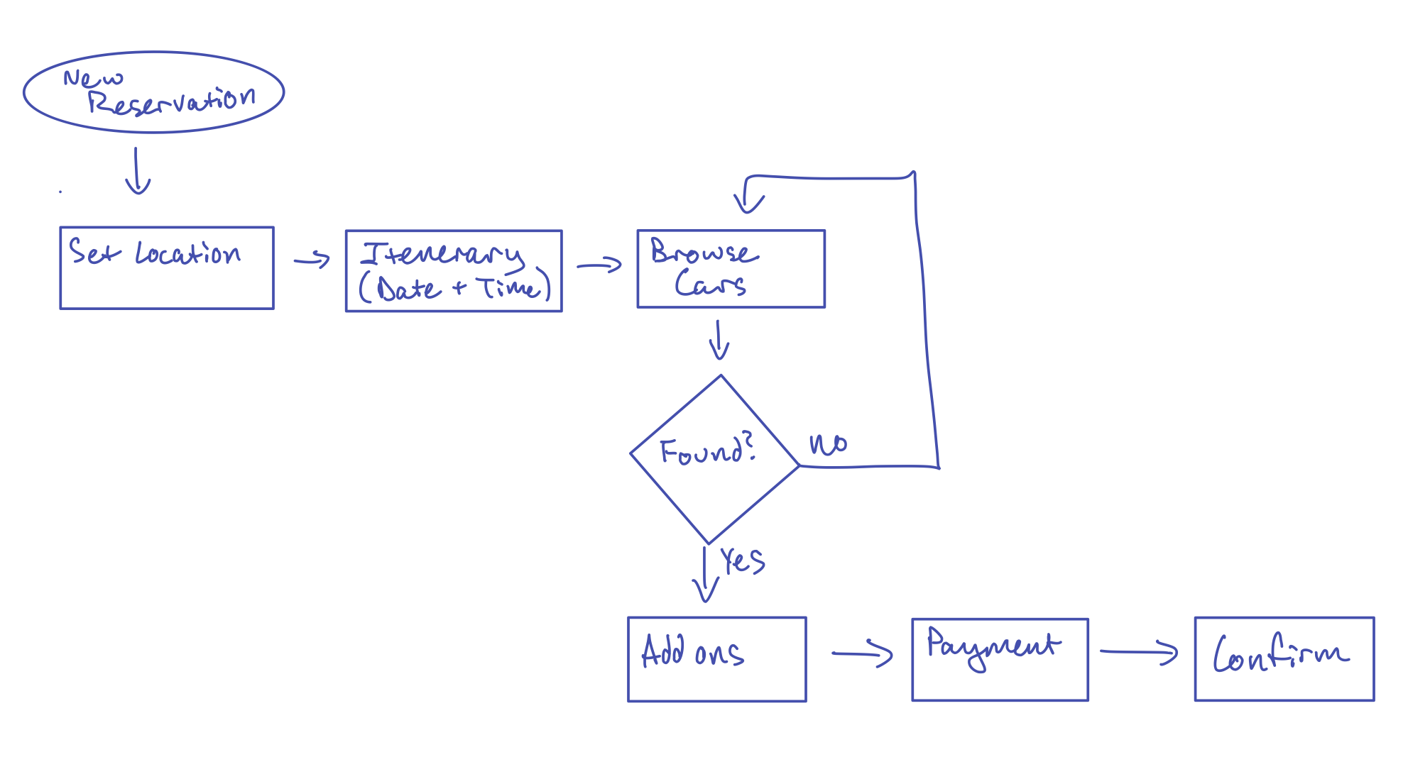
I made a user flow to really map out the distinct, necessary steps that the user must take to reserve a car — and nothing more.
I drew some wireframes up to start visualizing my ideas and solidifying the user flow with only the necessary steps.

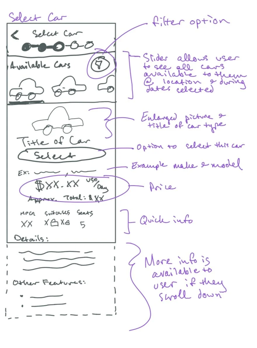
Here’s a detailed annotation of the main screen I was concerned with — the screen where users browse through and select a car. I wanted to lay out the information and content on this screen in a more dynamic, intuitive way that might reduce the amount of scrolling and clicking that a user currently has to do.
03
Design Solution
Satisfied with my wireframes, I pulled up Adobe XD to start making a high fidelity prototype of my solution.
Again, the current app is not terrible, so some of the screens look pretty similar to what currently exists on the app store. The main differences in my solution include the “Select A Car” screen and improved guidance to the user through the reservation process with a more streamlined interface.
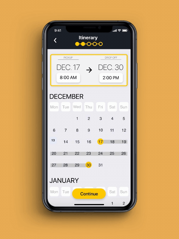
Setting an Itinerary
Setting an itinerary for a reservation is straightforward. Only including the necessary steps in the process and adopting common mobile interface interactions makes booking a car simple. Fewer screens, faster booking.
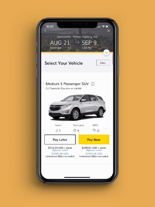
Select a Car
All the information you need is on one dynamic screen. Scroll through the cars available at your chosen location and see all the details you need to make a decision. No endless scrolling, no unnecessary pop ups.

Select Car Screen — Before and After
BEFORE
Users had to scroll through an endless list of cards so large that two different cards couldn’t be viewed on screen simultaneously. To get more information, they had to open and close pop up windows. Overall, this is a pretty poor interface for comparing information about the cars available.
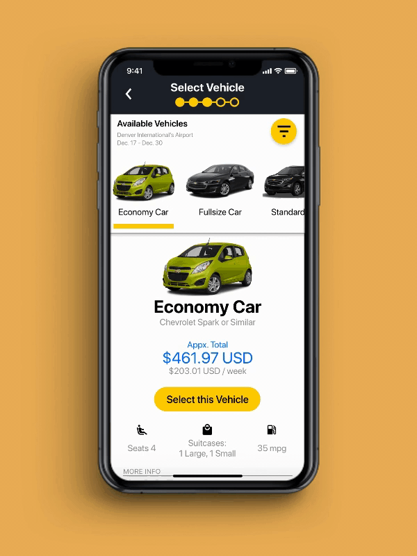
AFTER
The layout of information here caters to comparing information about available cars on a narrow mobile screen. The upper panel displays all options available, while the lower panel provides corresponding information about the currently selected option. No pop ups, no endless scrolling, better readability.
04
Parting Thoughts
For such a quick solo project, I was pretty satisfied with the design changes I made and with the visual design.
I felt as though cleaning up the user flow and redesigning the “Select A Car” screen gave the user more control and a better understanding of the reservation process and the options they had in booking a car. The layout of the new “Select A Car” screen gives the user proper affordance to compare cars available to them — something that the current interface does quite poorly.
Like I said, I’m not really a visual designer, but I was impressed with how I was able to stay true to the overall look and feel of the current Hertz mobile app (and tidy it up a bit).