LPRC Self-
Checkout
INTERACTION DESIGN
The client, the Loss Prevention Research Council (LPRC) is located in Gainesville, FL and partners with major retail chains to combat theft, loss, and fraud in retail spaces. As specified by the client, I was tasked with redesigning how users interact and engage in the self-checkout process in a way that might prevent losses in retail spaces.
My solution involved integrating a mobile app interface into the self-checkout experience to reduce shoppers’ mistakes, minimize the use of clunky hardware, and serve as a means of two factor authentication.
-
Role
All of them. It was one of THOSE group projects lol
-
Timeframe
1.5 months
-
Status
Completed
01
Research
“They [self-checkouts] are faster — you hit it and quit it”
“I have control over the situation”
A cycle of user research comprised of 7 user interviews was conducted to gain insight into the problem space. I asked about users’ current experiences with self-checkout kiosks, attempting to understand how the interfaces, software, and hardware involved in self-checkout interactions contribute to both positive and negative experiences.
KEY TAKEAWAYS
Users really enjoy the control and efficiency of self-checkouts. There’s no need to interact with anyone and the process is usually very quick.
While the actual software is pretty straightforward, users were annoyed with the hardware — it’s laggy, buggy, and causes them to make mistakes.
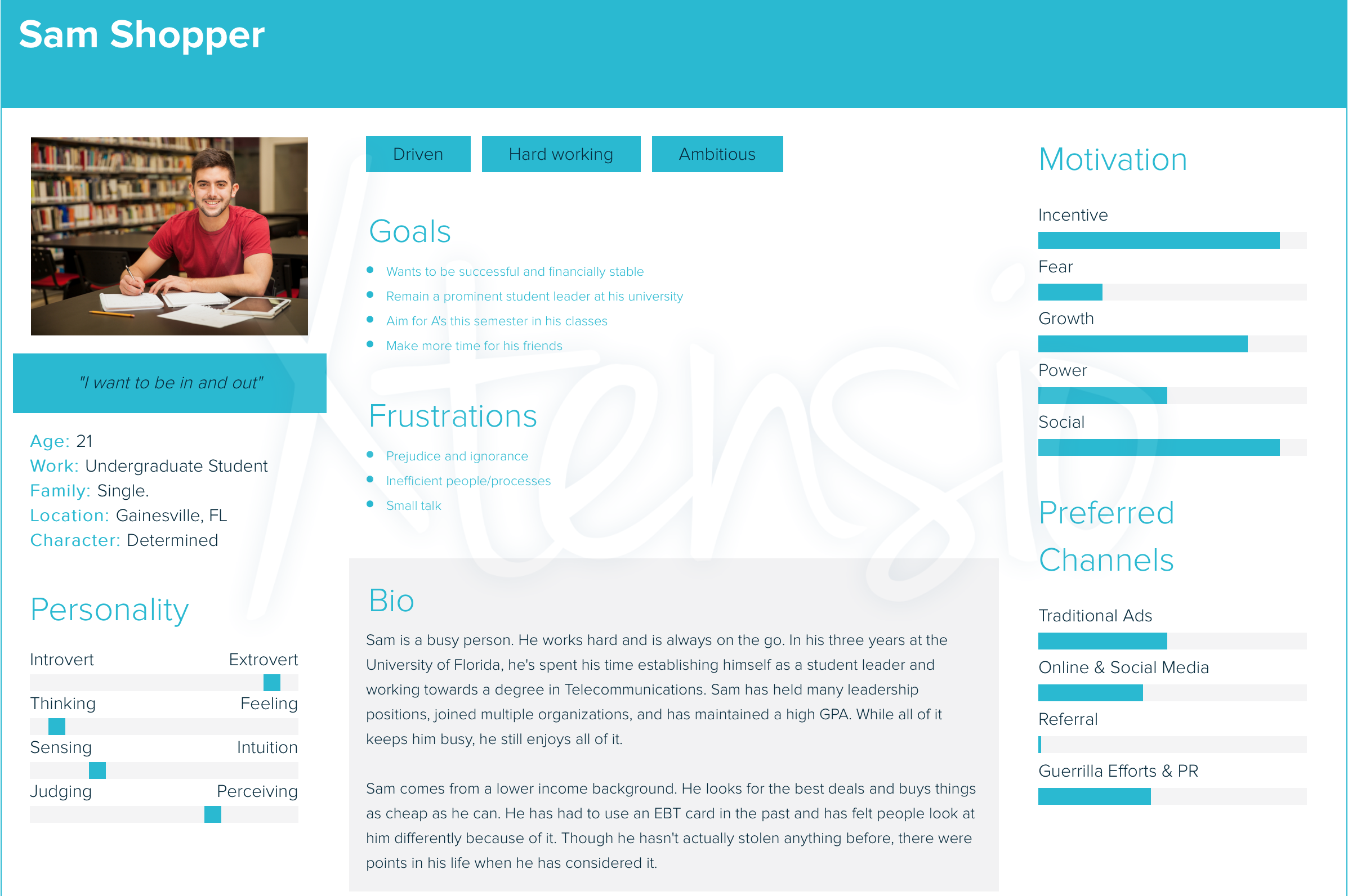
Self-checkouts can make shopping inclusive — “I’m not embarrassed when I pull out my EBT card.”
Making mistakes at kiosks = stressful.
02
Ideation
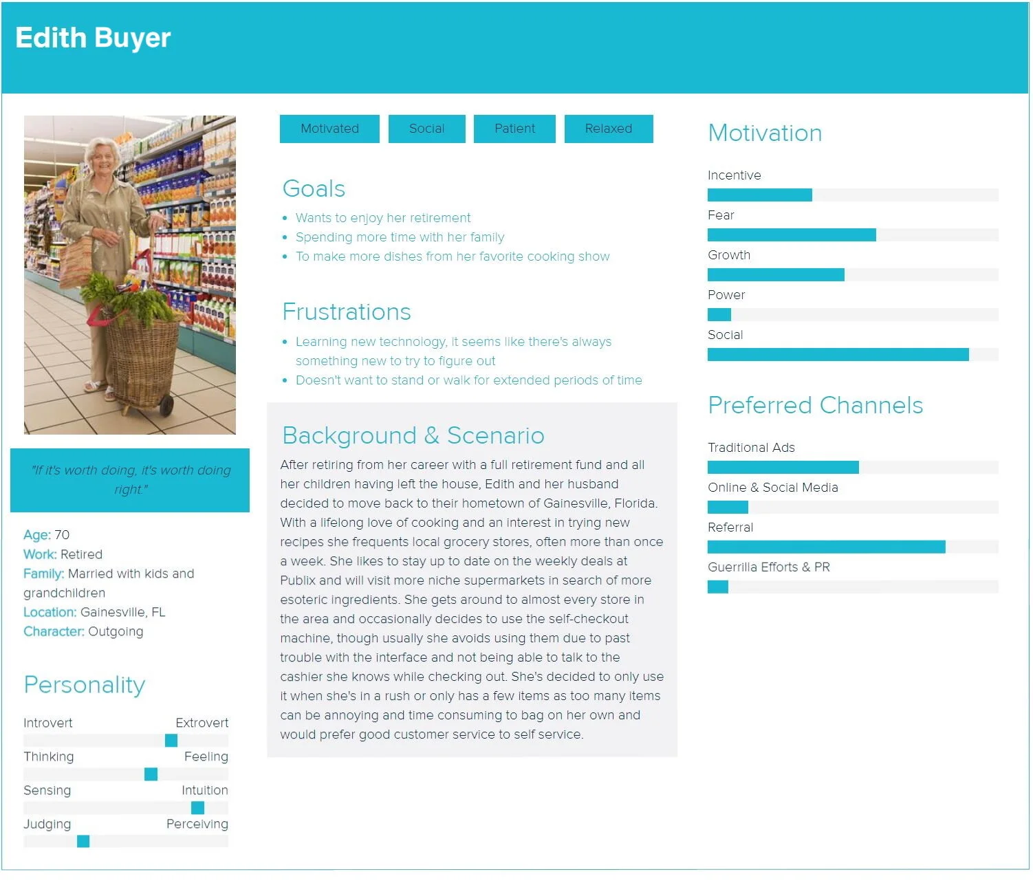
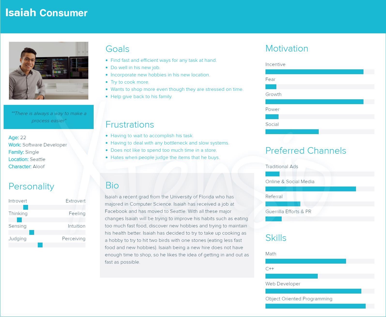
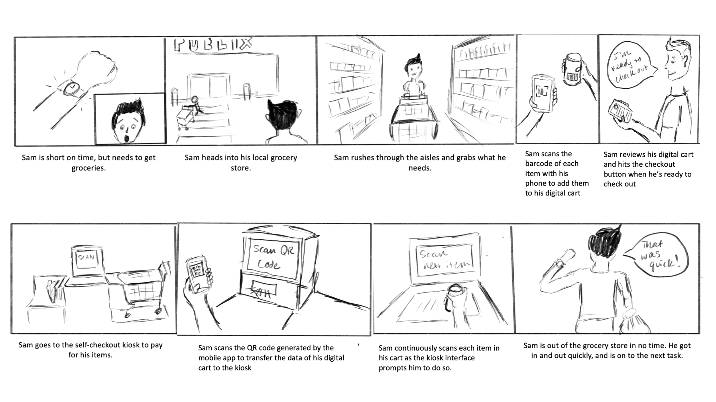
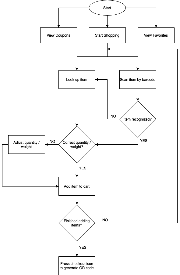
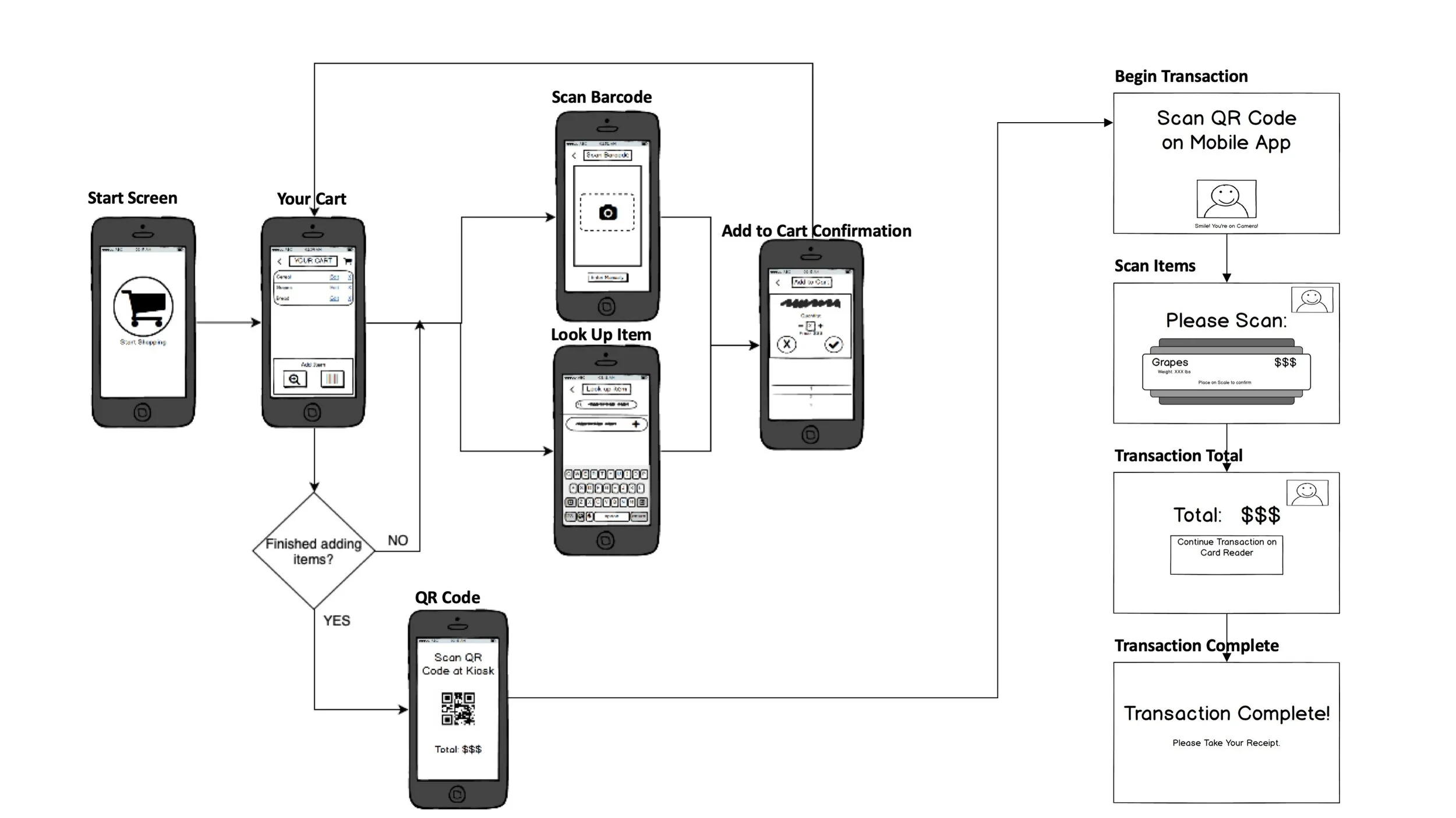
After some synthesizing and brainstorming, my potential design solution involved integrating a mobile app interface into the self-checkout process. I created some flows and wireframes to illustrate my ideas.

03
Prototyping
To start out, I made a rough paper prototype of my solution. I conducted a round of usability testing to get feedback before I moved forward. At this point in the process, I also got some really useful feedback from the LPRC and decided to take these insights forward.
INSIGHTS FROM USABILITY TESTING
Users were able to complete all tasks with minimal errors, but took a very long time to do so.
The current interface did not provide enough affordance for the user to understand this reimagined self-checkout process. I needed to provide more guidance within the interface.
Users were annoyed and did not see the purpose in scanning items twice — once on the app and again at the kiosk.
INSIGHTS FROM CLIENT
The client suggested that the design team expand the scope of the application as a way to present it as a “shopping assistant” rather than a tool to operate self-checkout kiosks.
They suggested adding additional features to the app to gamify or incentivize the experience.
04
Design Solution
I took the insights gained from the low fidelity prototype and moved forward towards a higher fidelity. I then conducted another round of usability testing to see if the changes made had an effect on the user experience.
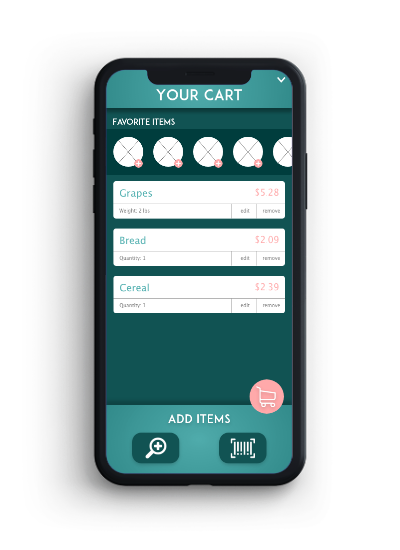
View and edit items in your cart. Search items or scan their barcodes to add them to your cart.
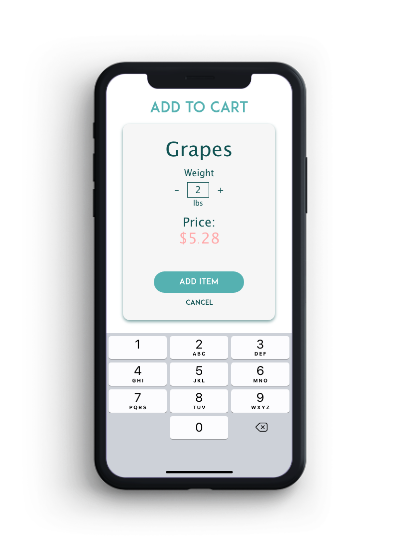
View details of products and adjust before adding to your cart.
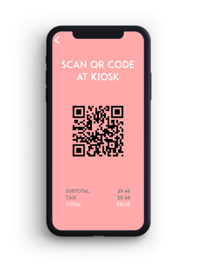
Transition the transaction to a self-checkout kiosk with a uniquely generated QR code.
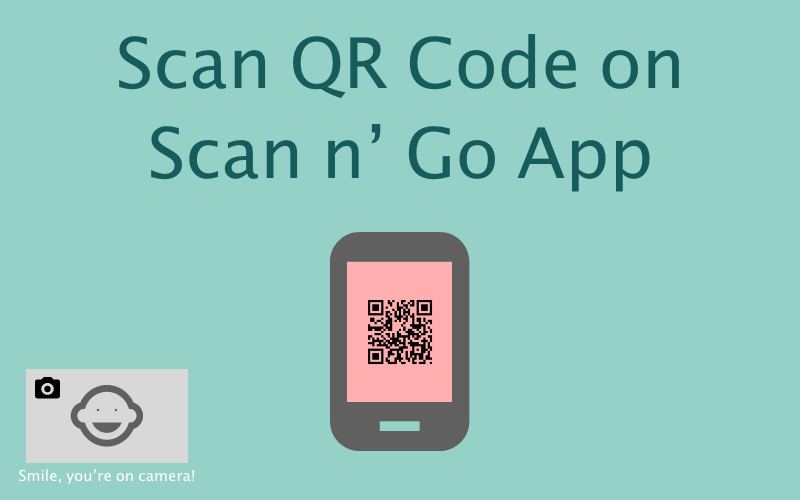
Scan your unique QR code at a self-checkout kiosk to begin the transaction.
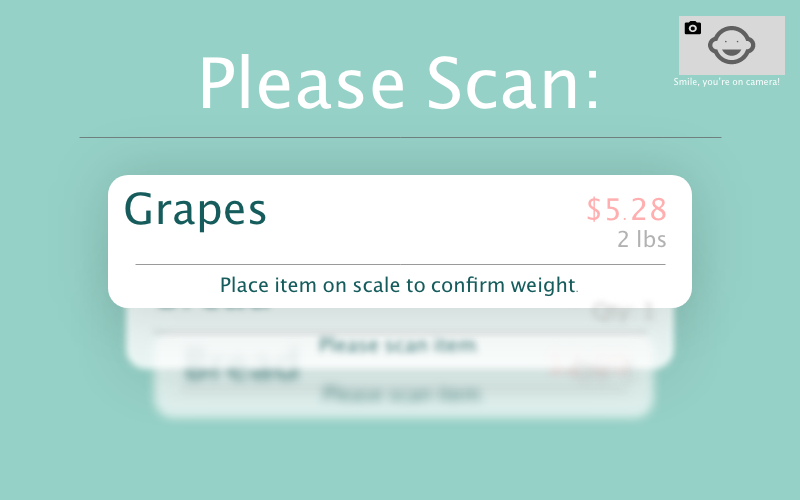
Scan items as you’re prompted. No need to use clunky touchscreens, no items forgotten in your cart.
INSIGHTS FROM USABILITY TESTING
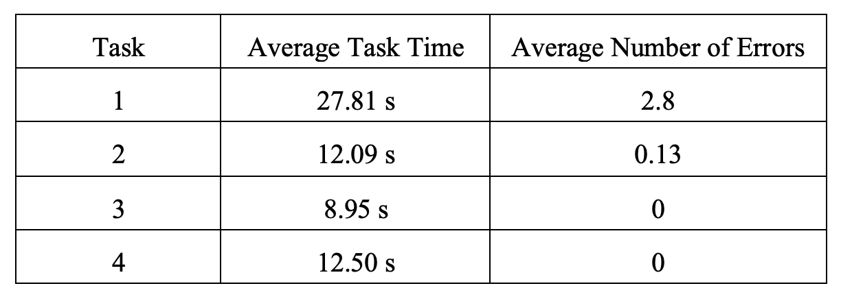
100% task completion rate
Users were not nearly as confused nor as slow to complete tasks as they were with the paper prototype.
Users still did not like the fact that they had to scan items twice. They wanted more incentives and mentioned that they wouldn’t be motivated to use the app or self-checkouts as the product was.
05
Parting Thoughts
When at a traditional checkout counter, the cashier essentially “double checks” that you’re paying for the items in your cart. My solution attempts to put that responsibility of “double checking” onto the user and the technology they use every day.
While my redesigned self-checkout system would reduce unintentional losses and minimize user interaction with clunky self-checkout hardware, users STILL didn’t like the fact that they had to scan items twice to “double check.” I believe that adding more incentives could definitely draw users toward this safer system, but that is a question for retail chains to answer and is completely out of my hands!
EDIT, 2022: Ummmmm, have you been to Sam’s Club or BJ’s Wholesale Club recently? Because both of these stores now have VERY similar self-checkout methods to what was outlined in this case study. These new self-checkout methods require users to scan items as they add things to their cart and a QR code is generated to help employees verify purchases. The design of these systems and interactions are close enough for me to be suspicious, ya know? Those stores only rolled out their new self-checkout processes within the past 2 years, and I completed this project in 2018… all I’m saying is that no one’s written me a check yet. They even call it “Scan n’ go” …
